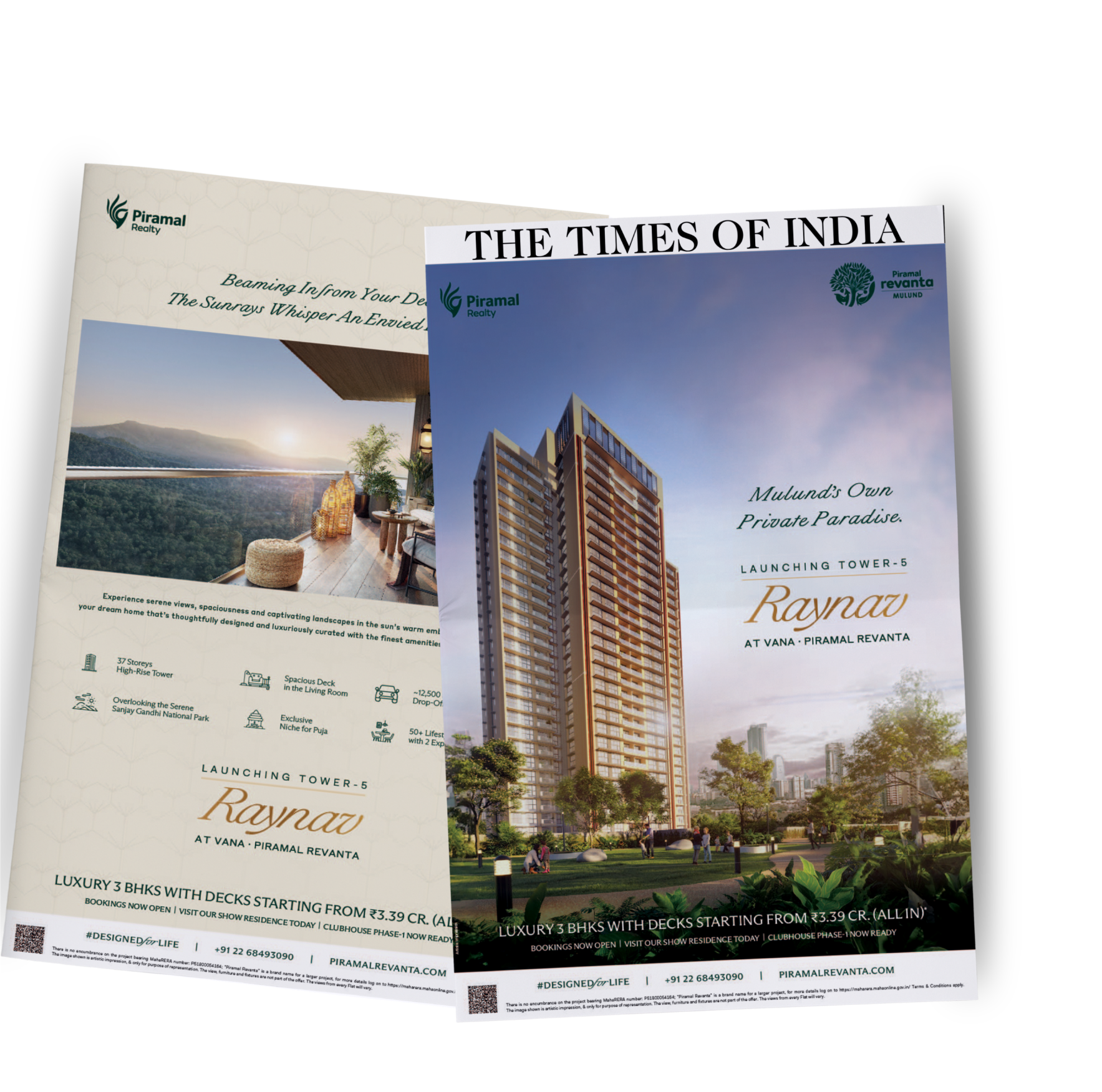
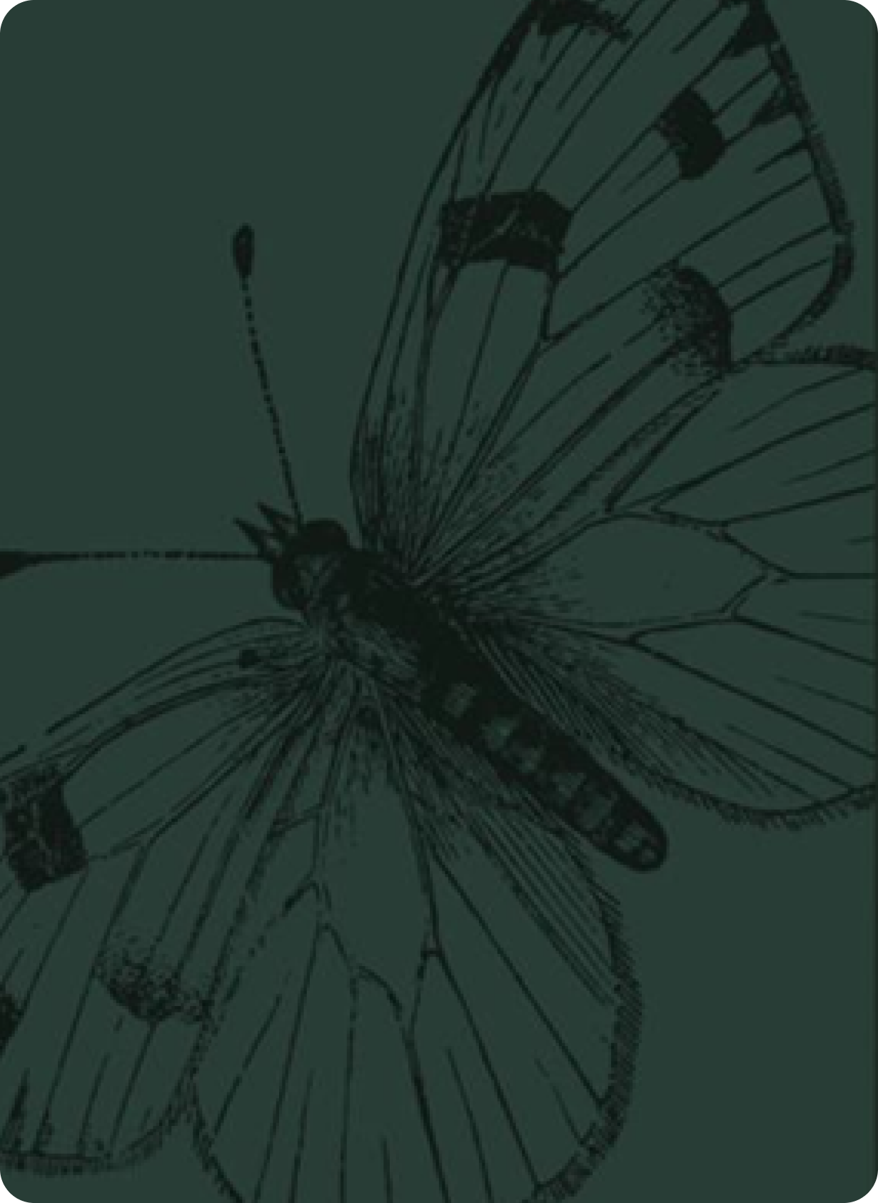
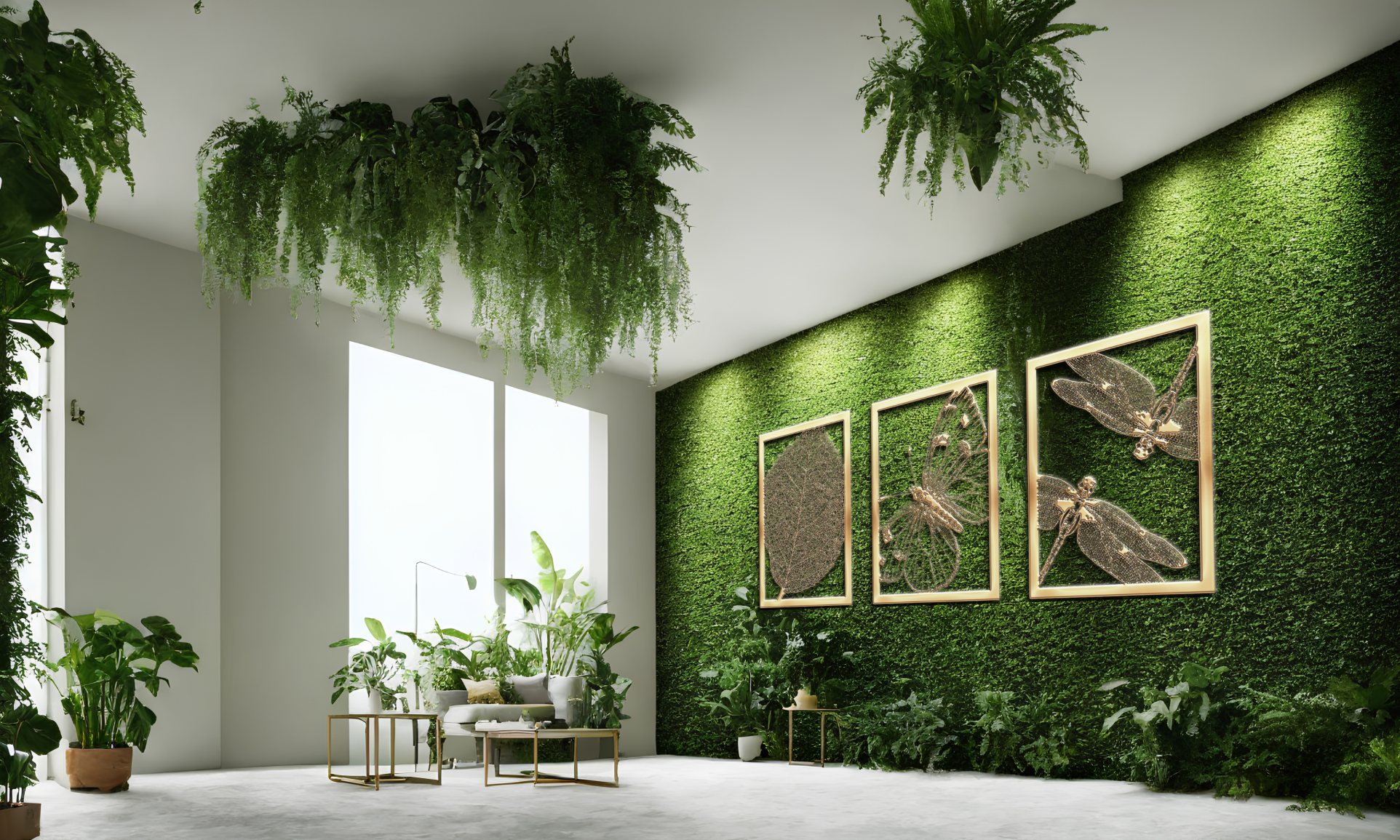
For Raynav, we drew inspiration from the natural world around the development. Butterflies, fireflies, and diverse leaf forms became central motifs, capturing the vibrancy of flora and the quiet magic of its ecosystem. These elements were woven into the visual language and collaterals, ensuring the brand felt alive, organic and deeply rooted in biophilia.


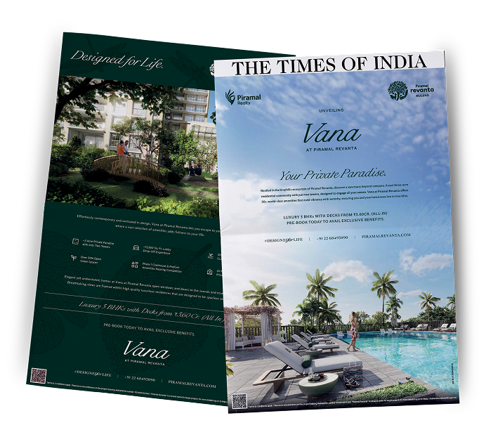
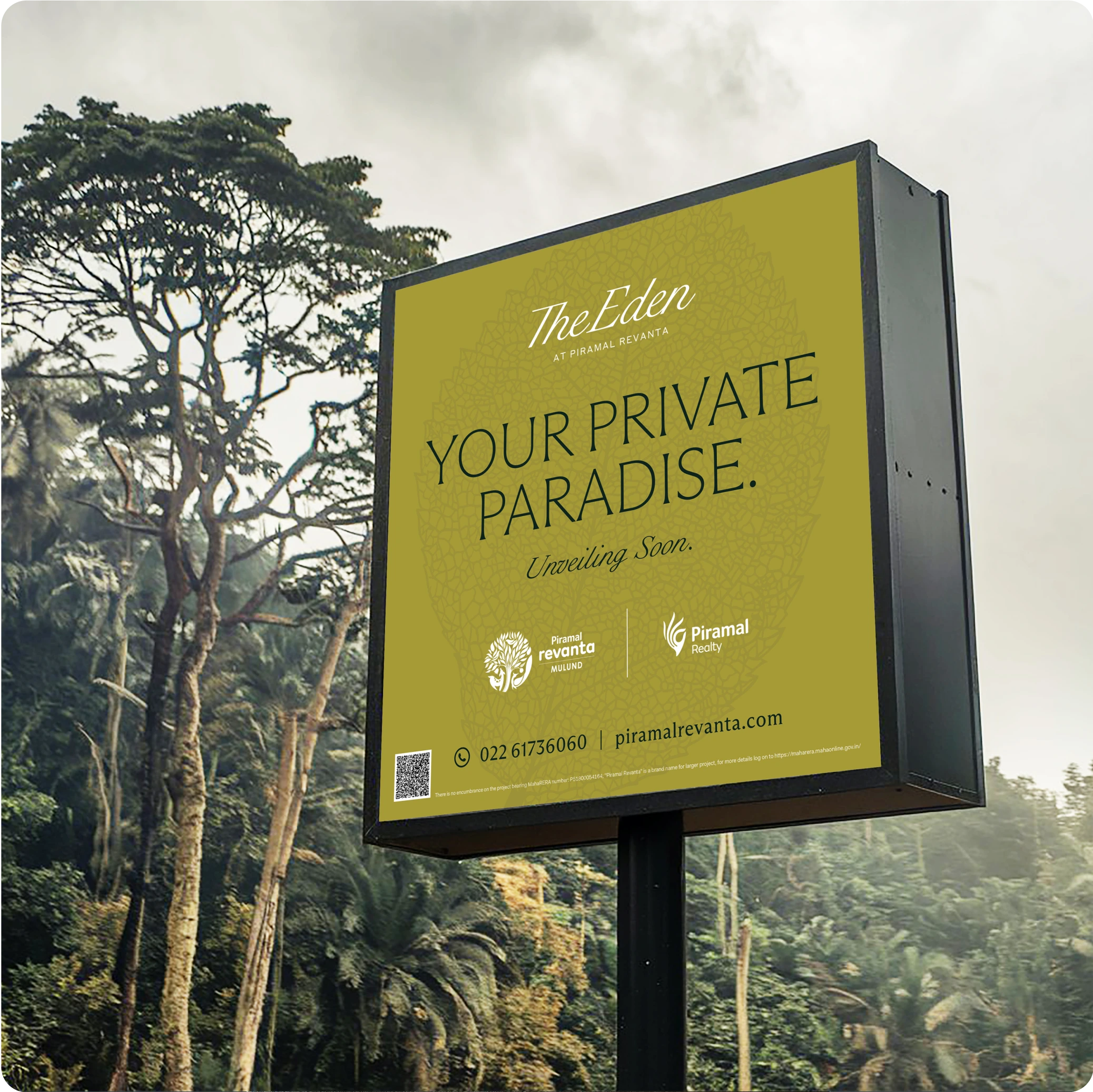
With the launch of Phase 2 of Piramal Revanta, we paved the way for a new perspective. Phase 2, VANA, found its own voice through fresh communication, a new visual language and a narrative that sparked intrigue. We helped turn a hidden pocket of land into a Private Paradise with an identity of its own.